
Brand identity
A brand identity that holds together once other people start using it.
We design brand identities for businesses that have outgrown the one they have. The logo is the part everyone talks about and the smallest part of the job. What decides whether an identity survives is the system underneath it: the type, the colour, the rules, and whether a new starter can pick it up and get it right without asking. We settle the positioning first, then design against it.
What we make
A mark, and everything that keeps it honest.
The mark and the system around it
Logo, type, colour and the brand language that ties them together. Designed as a set, so the parts still agree when they are used apart.
Rules somebody will actually follow
Guidelines written for whoever is making the next thing, not filed and admired. Short enough to read, specific enough to settle an argument.
Applied to what you actually send
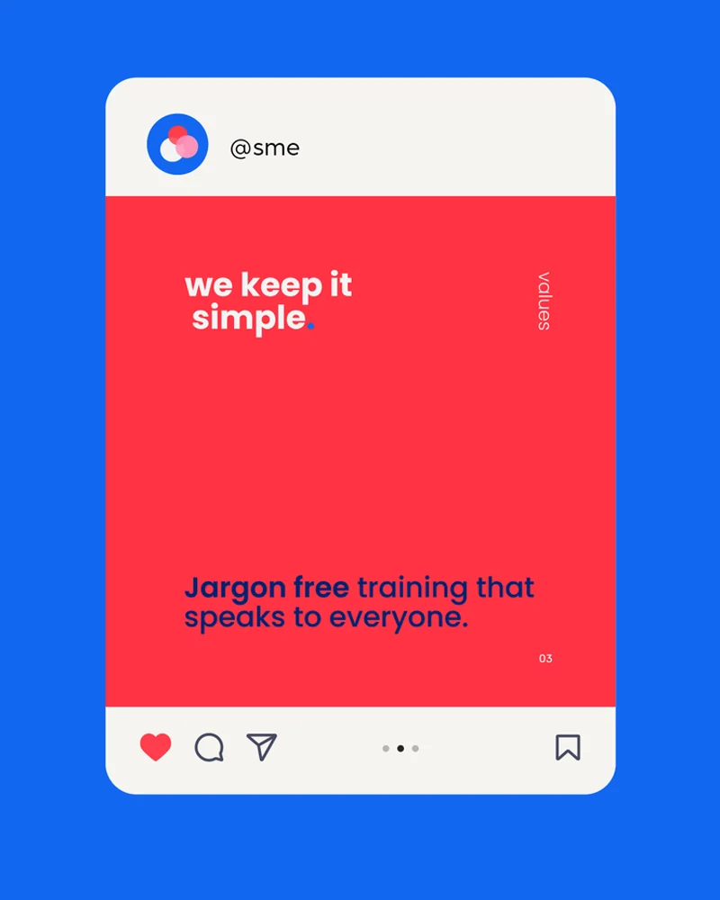
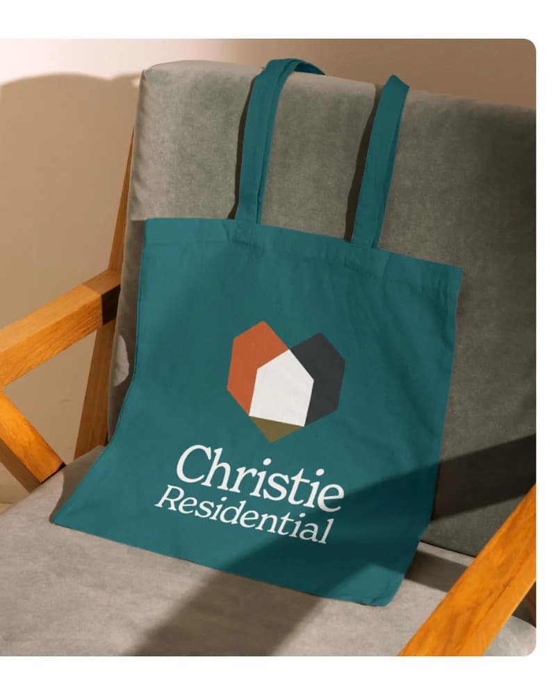
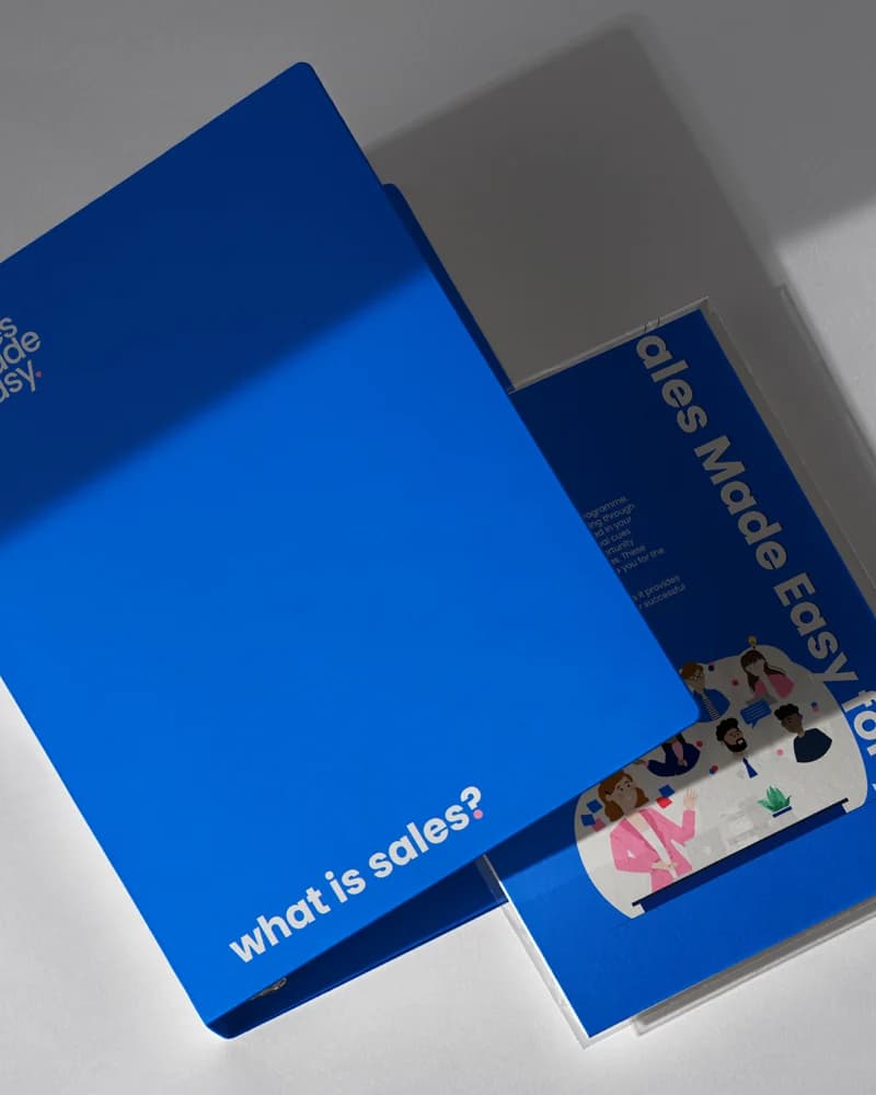
Decks, proposals, signage, packaging, livery, social. An identity only exists where people meet it, which is rarely the logo on its own.
Naming, where the name is the problem
Sometimes the work starts a step earlier. We have named businesses and product lines where the existing name was doing the damage.

How we approach it
The design is the last decision, not the first.
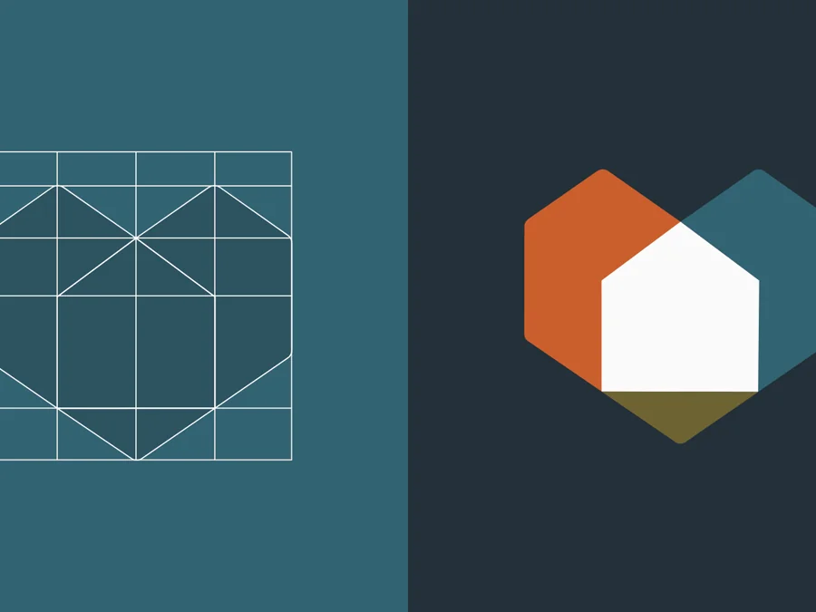
Strategy first, always.
We do not open a design file until the positioning is settled. Design executes an argument. Without one it is decoration, and it gets rejected on taste.

Designed for the hardest application.
Anything looks good large and centred on a white page. We test the mark small, in one colour, on a vehicle and on a phone, because that is where identities come apart.
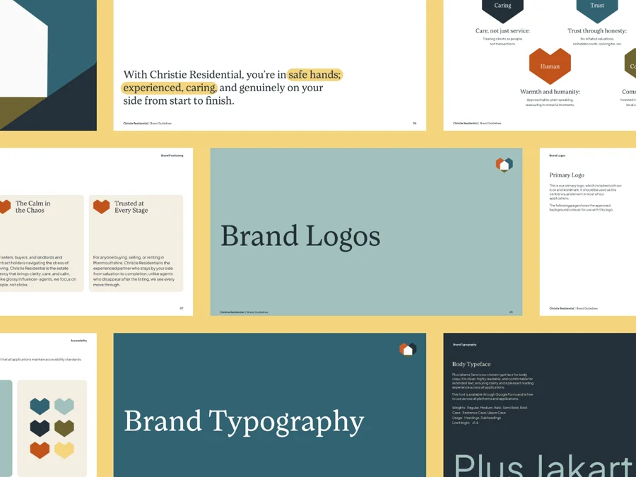
Built to be handed over.
You get the files, the rules and the reasoning. The measure of the job is whether your team still gets it right in a year, with us not involved.
What changes
You stop paying for it twice.
Your team stops asking which version of the logo to use, and stops inventing a new layout for every deck.
Proposals go out looking like they came from the same company as the website. New hires get the language right in their first month rather than their sixth.
And you stop paying twice: once for the design, and again for the tidy-up after three people have each made their own version of it.
Selected work
Identities built to be used, not admired.


Before you commission
Some of this you can judge yourself.
The difference between brand identity and brand image is worth understanding first, because it decides what a rebrand can and cannot fix. Why guidelines matter more as the team grows is written up in full, and so is what inconsistency costs a business. For the process end to end, there is a guide to designing a brand identity that holds up.
Free download
The checklist we run before every workshop.
Twenty things we check before we start any brand build. Use it to find the gaps in your own brand: where it is vague, where it is inconsistent, and where it is quietly costing you work. Add your email and we will send it straight over, plus the occasional note when we publish something worth your time.
Book a Clarity Call.
Tell us what is not working. We will tell you honestly whether it is an identity problem or a positioning one, and which to fix first.