From idea to screen: building the Practice Toolkit animations
If you’re considering an explainer, the Practice Toolkit animation process matters as much as the final render. These two videos needed to sell the story and the product fast, without turning into a feature dump. One video (“Why”) sets the mission and context. The other (“PRO”) shows the value of the first tool, Pro, in plain English.
They’re built to work as short, modular chapters, so Practice Toolkit can add more tools and extend the story later, without rebuilding everything from scratch.
Step 1: Discovery and goal-setting (what the videos must do)
We started by pinning down the outcomes, not the visuals.
- Primary goal: get practices to start a trial, because the product becomes obvious once someone sees their own data in it.
- Secondary goal: make the product feel credible, not “too good to be true”. That affected how we framed claims and avoided wild promises.
- Audience reality: decision-makers are often GP partners, but the video link might land with a practice manager or senior admin first. It had to work for all of them.
We also agreed early that the videos shouldn’t try to teach the software in depth. They’re teasers that point to the trial and demo path.
Step 2: Extracting the story from the product (turning complexity into a simple arc)
Practice recall optimisation is complicated. The risk with med-tech is that you end up with a video that sounds like a training manual.
So we pulled out the simplest “pain to outcome” arc:
- Recalls and medication reviews create constant admin, duplicated appointments, and missed checks.
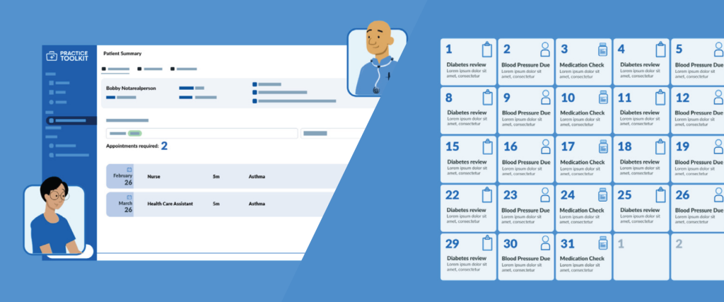
- Pro converts that chaos into a monthly view of what needs to be done, who needs to be invited, and what each patient requires in an appointment.
- The platform aims to reduce admin time, reduce wasted appointments, and increase income from claims by preventing “missed box” failures.
That gave us a narrative we could show visually without getting stuck in jargon.
Step 3: Scriptwriting (two scripts, two jobs)

We wrote two scripts with different roles:
“Why” animation (short)
This script focuses on the reason the Practice Toolkit exists: frontline pressure, rising administrative burden, and a push to help practices run more effectively. It also tees up the “toolkit” concept: Pro is the first tool, with more coming later, shaped by real practice needs.
“PRO” animation (longer)
This script focuses on what a viewer gets in practical terms:
- A guided trial experience instead of “you’ve signed up, good luck.”
- Uploading data quickly, processing it fast, then landing on the monthly plan view that triggers the “lightbulb moment”.
- Clear outputs that can be shared with partners and decision-makers, including an impact-style summary.
We also avoided overloading the script with niche terms. Where needed, we used only the terms the audience already uses, like patient recalls, medication reviews, Shared Care protocols, and QOF-style payment/claims concepts.

Step 4: Visual plan and storyboard (show enough, without locking to UI)
The client flagged that the UI was still MVP and likely to change. So we didn’t build a video that depends on exact button positions or menus.

Instead, we storyboarded around:
- A “practice chaos” setup: spreadsheets, repeated invites, missed checks, frustrated patients
- A “system shift” moment: data goes in, structure comes out
- Visual metaphors for: monthly planning, merged appointments, fewer repeat visits, and clearer workflows
Where we referenced the platform, we kept it “blocky” and simplified: branded colours, basic panels, and recognisable dashboard shapes, without pretending it’s a pixel-perfect UI recording.

Step 5: Animation build (modular scenes for future add-ons)
We built both animations as reusable modules:
- Intro and framing scenes
- Benefit scenes (admin, appointments, claims)
- Proof scenes (show what someone sees after upload)
- CTA end-card scene (easy to swap for A/B testing)
That modular approach matters because Practice Toolkit wants to add tools over time and update “coming soon” sections without redoing the whole video.
Step 6: Voiceover, sound, and final polish (trust signals)
For voiceover, we planned for a friendly, credible delivery. The product sits in healthcare, so the tone needs warmth, but it still needs authority. The goal is simple: make the viewer feel like, “Yep, they get it, and this won’t waste my time.”
Then we tightened:
- pacing to match on-screen moments
- small pauses for key lines (especially the trial CTA)
- music and sound design that supports, not distracts
Step 7: Delivery and final result (what you actually get)
The finished outcome is a matched pair of videos:
“Why” gives Practice Toolkit a clear mission story and a consistent opener for emails, the website, and outreach.
“PRO” gives a confident product narrative that focuses on what a practice gains quickly: upload data, see the monthly plan, understand impact, and start a trial.
Together, they build trust and remove friction. The viewer doesn’t need to “get software.” They just need to see that their recall workload can stop living in spreadsheets and guesswork.
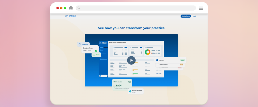
To bring it all together, here’s a still from the finished animation now live on Practice Toolkit’s site. This frame captures the core idea behind the project: turning complex recall work into something practices can see, understand, and act on quickly. The full video builds on this moment, showing how the platform moves from raw data to a clear monthly plan, and why starting a trial is the fastest way to see its impact in a real practice setting.

For more information about Practice Toolkit, head over to their website www.practicetoolkit.co.uk
If the Practice Toolkit animation process sounds like what you need, have a look at our portfolio and see how we turn complex products into clear, sales-ready videos. If you’re planning a launch or need a new explainer, get in touch and we’ll quote based on your scope, deadline, and distribution plan.